Glow & Go is a startup organic fast food brand created for fitness-minded women who value healthy eating, convenience, and an active lifestyle. The brand was developed to feel feminine, energetic, and organic, with a visual identity designed to support future product and packaging applications.
- Glow & Go
- Naples, Fl
- Visual Identity
- Organic Food & Beverages
- Illustrator / Photoshop
Challenge
The challenge was to create a brand identity that could balance a girly and playful personality with the values of organic, healthy food. The client specifically wanted black and fuchsia as non-negotiable colors, so the visual system needed to make those bold choices feel fresh, feminine, and aligned with a wellness-focused food concept.
Goals
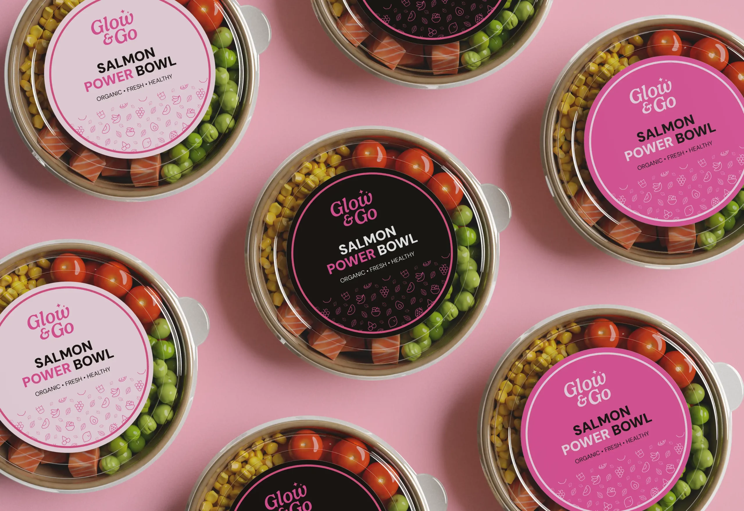
The goal was to create a memorable and flexible identity for a new organic fast food brand that would appeal to fitness-oriented women looking for healthy, convenient meals. The visual system needed to balance a bold, girly aesthetic with an organic food concept, while also supporting future applications across packaging, products, stickers, and promotional materials.
Solution
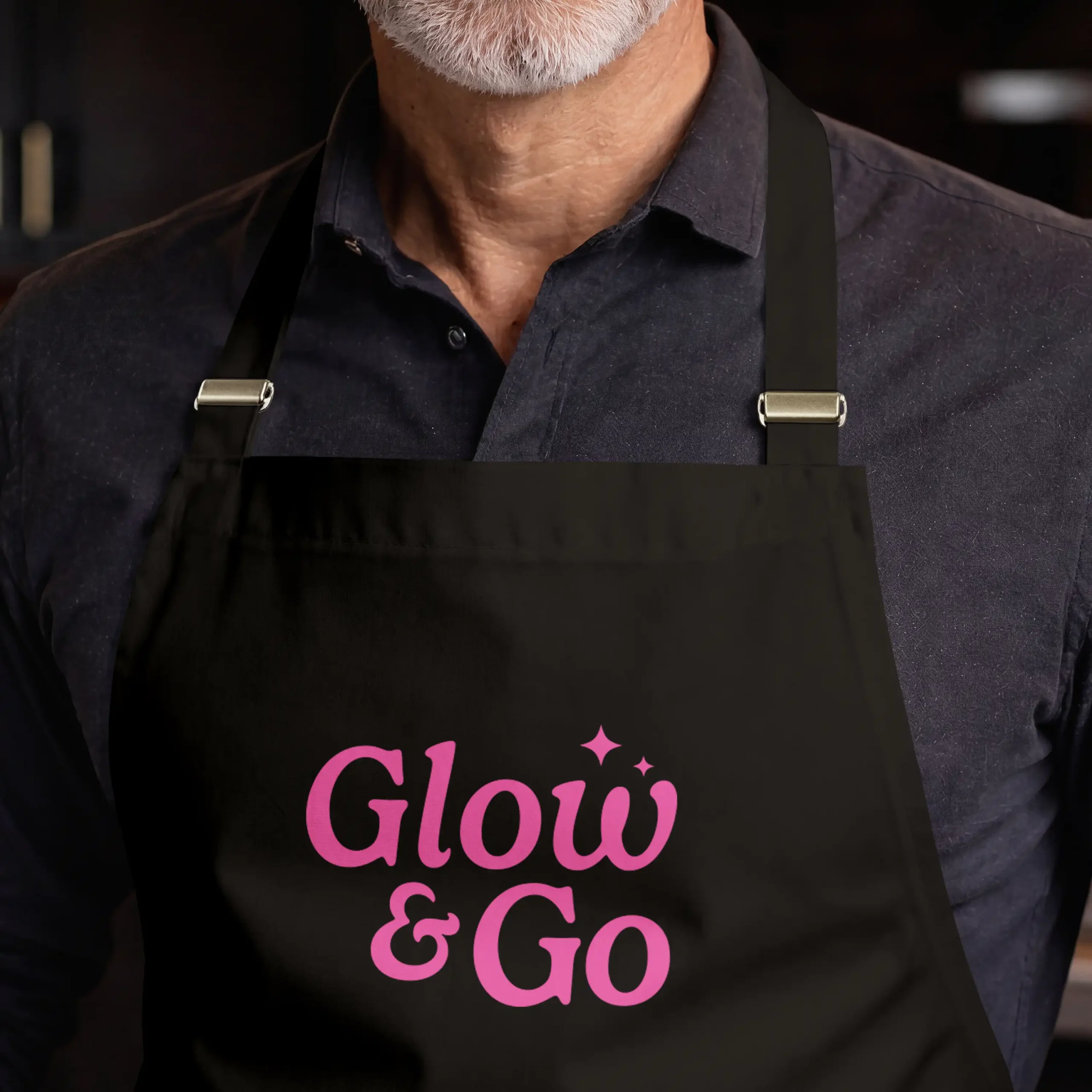
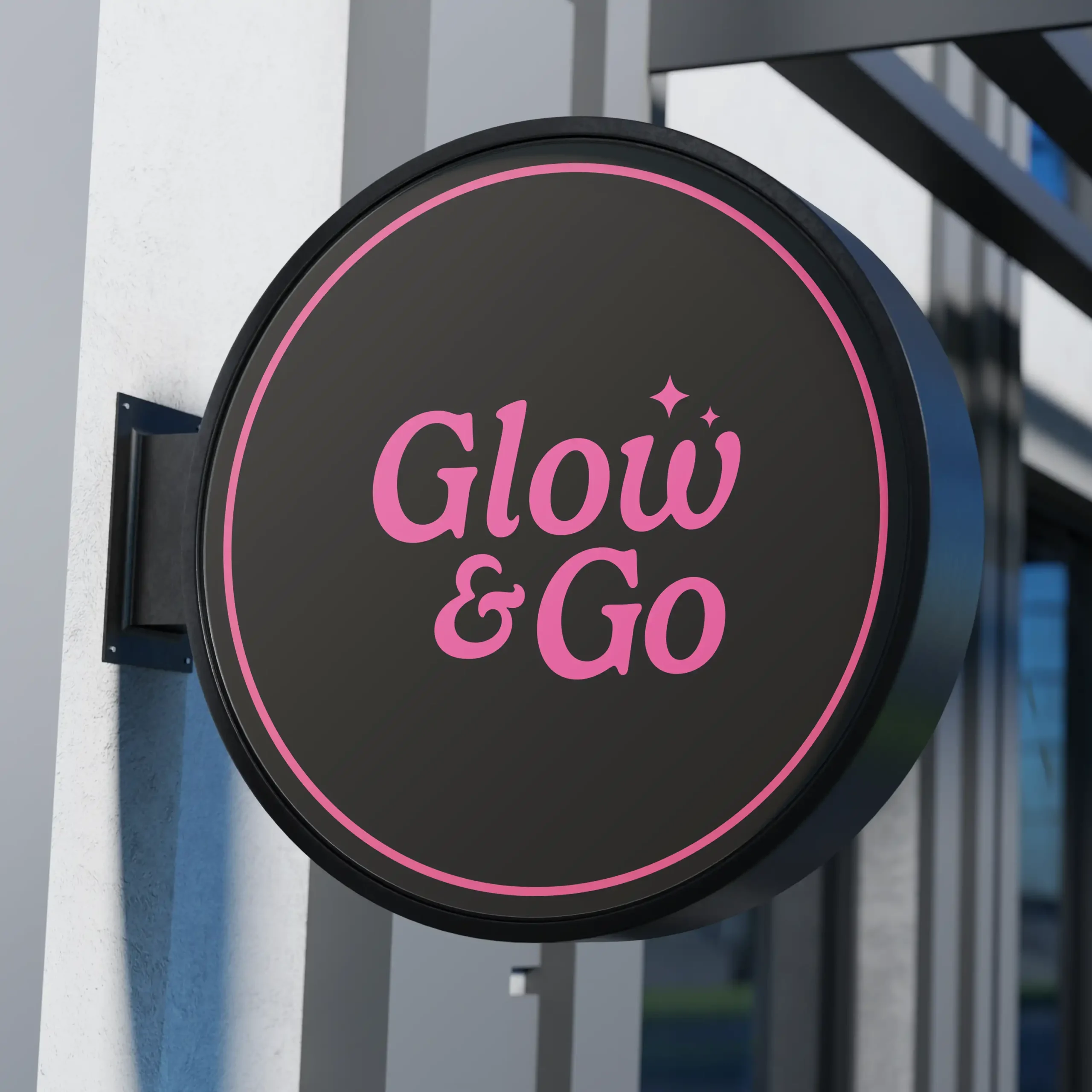
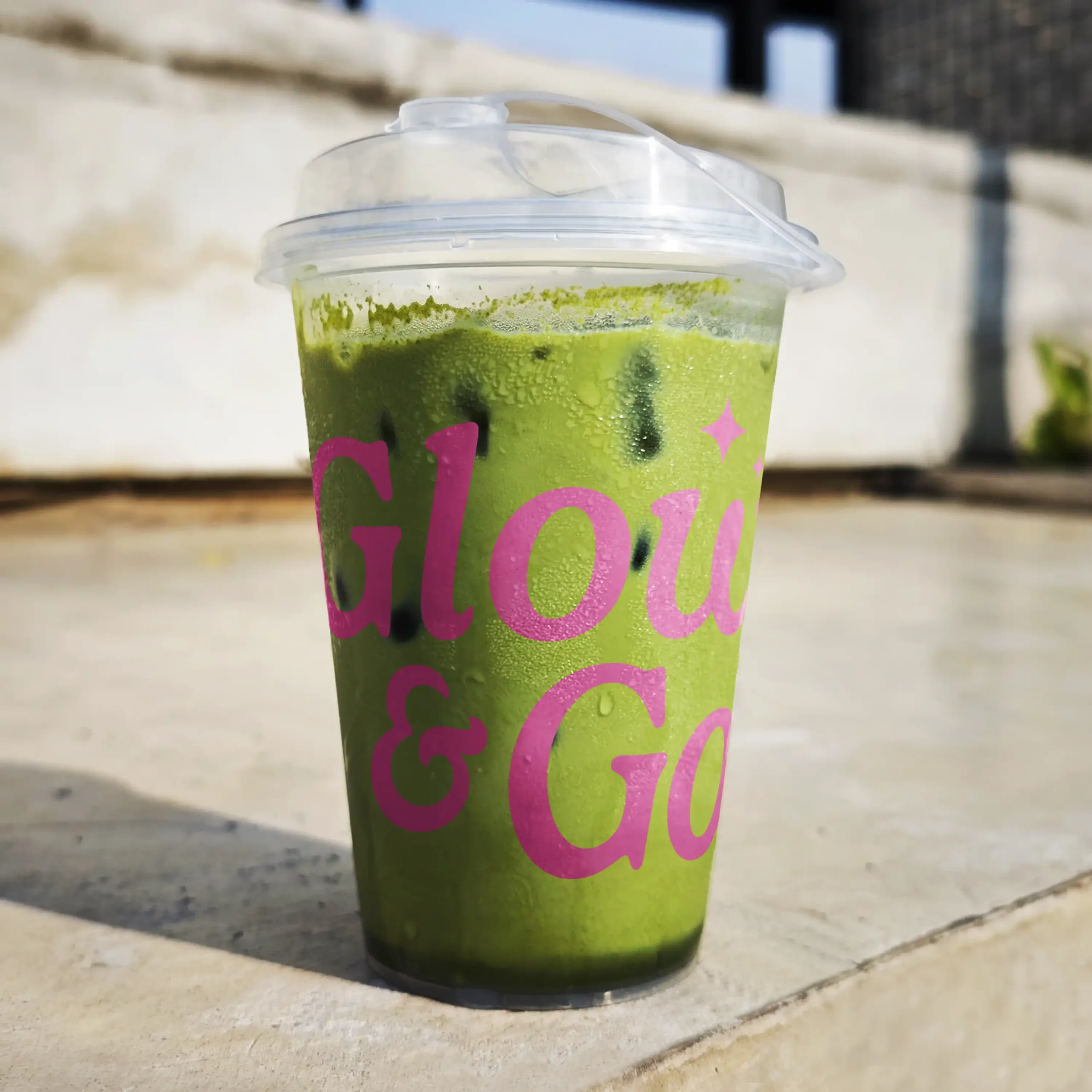
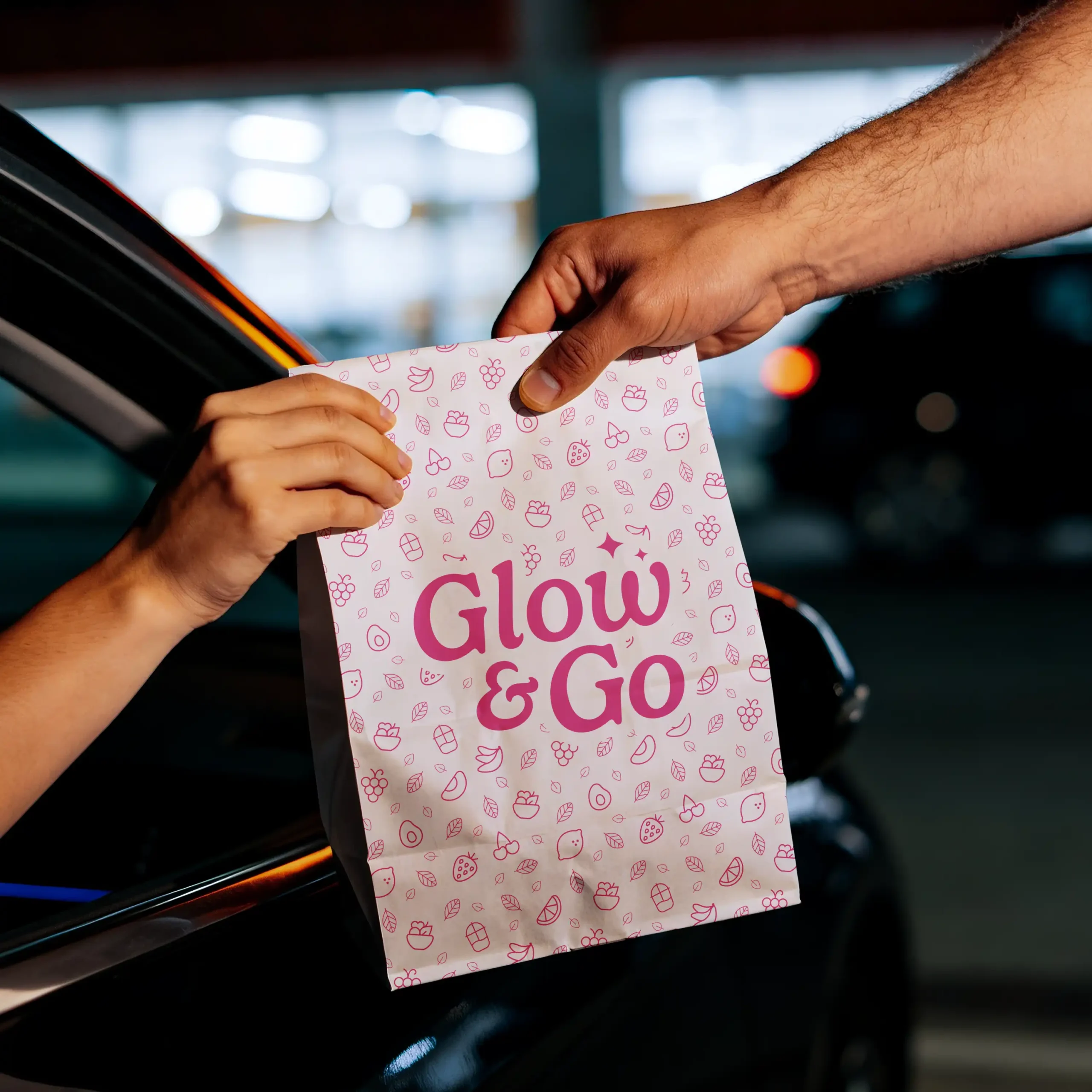
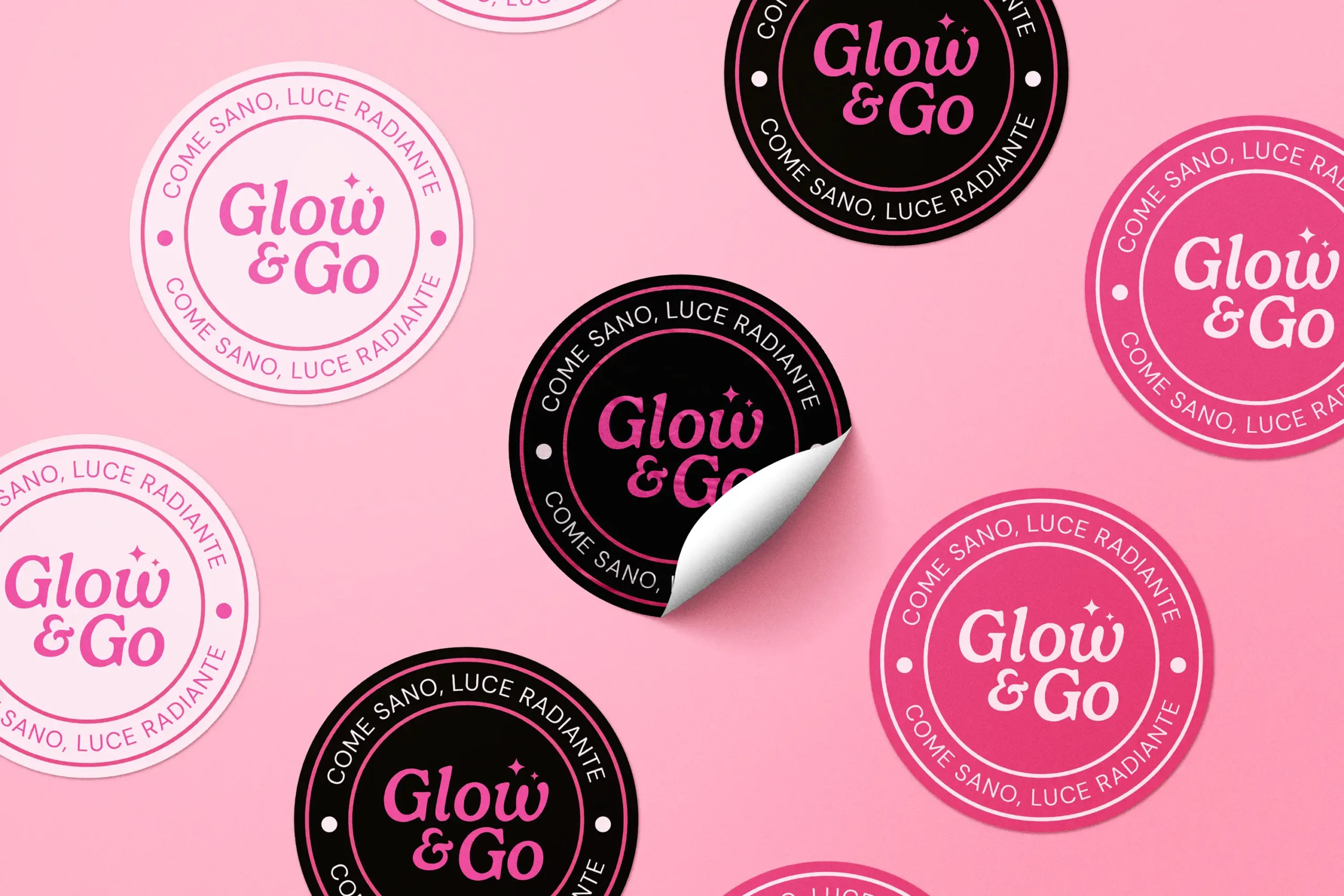
The visual identity was built around a bold yet feminine logo system, using fuchsia, pale pink, and black to balance energy, contrast, and freshness. The logo’s playful curves and sparkle details communicate glow and movement, while the color variations allow the brand to adapt across light, dark, and high-impact applications.
Results
The final identity gives Glow & Go a clear and flexible brand foundation for its future launch. The system combines a strong visual personality with practical applications for packaging, products, and promotional materials, helping the brand feel energetic, feminine, and ready to grow. Although the business has not yet been implemented, the project established a cohesive direction for how the brand can appear across future customer touchpoints.
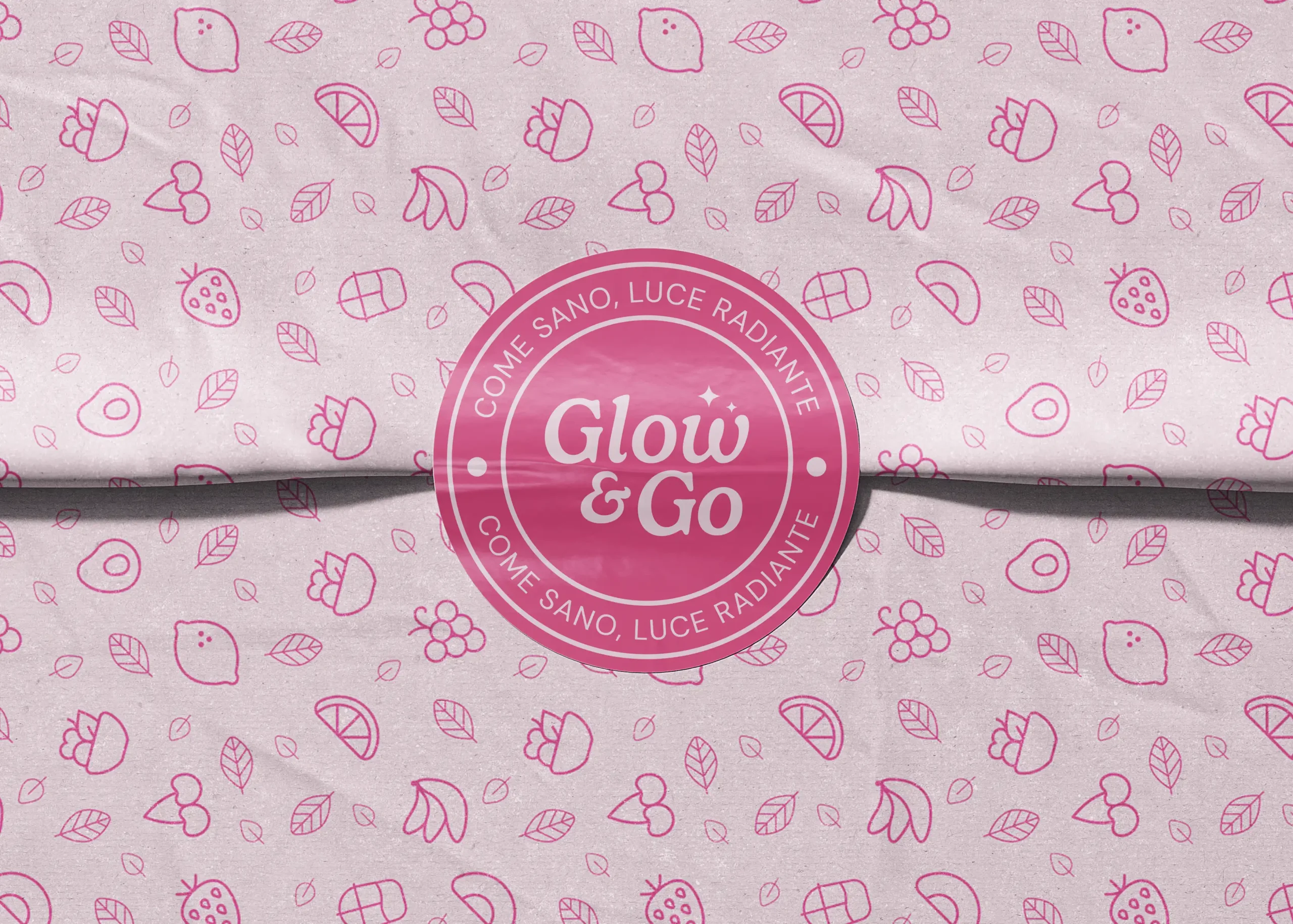
A supporting pattern featuring fruits, smoothies, and fruit bowls was created to reinforce the organic food concept and extend the identity into stickers, packaging applications, and branded materials.
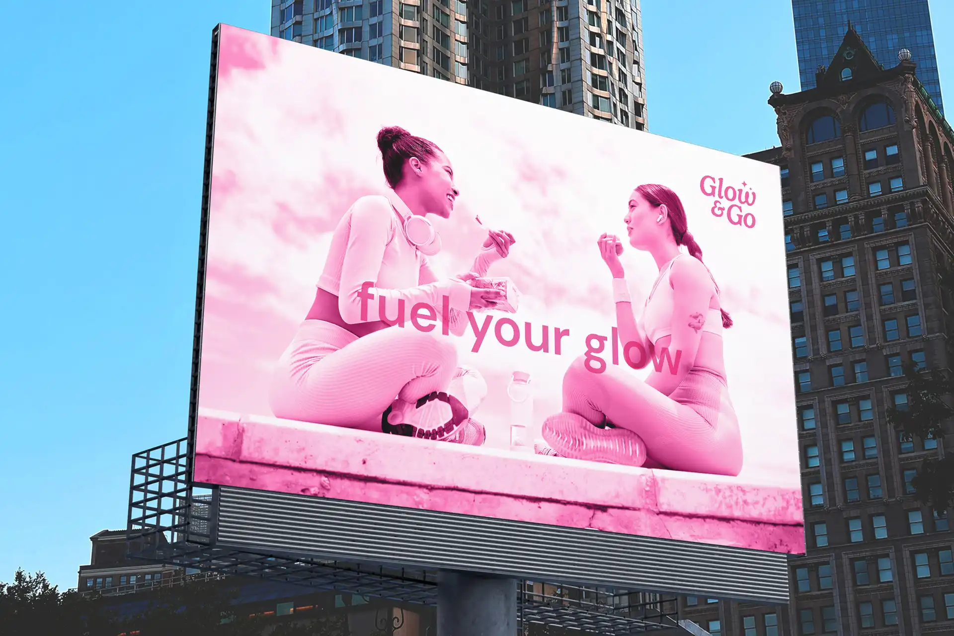
The identity was also supported by promotional copy that connected healthy eating with energy, confidence, and well-being. “Fuel Your Glow” was used as a bold, energetic message for larger promotional pieces, while “Come sano, luce radiante” adapted the same idea into a warmer Spanish-language expression for stickers and product applications.