CodeBerry Solutions is a small but powerful tech studio that partners with entrepreneurs to bring their software and analytics ideas to life. The team approached me seeking a complete brand overhaul to better align with their evolving identity and target market.
- Codeberry Solutions
- Barcelona, Spain & USA
- Brand Identity Redesign
- Software Development / Tech Consulting
Challenge
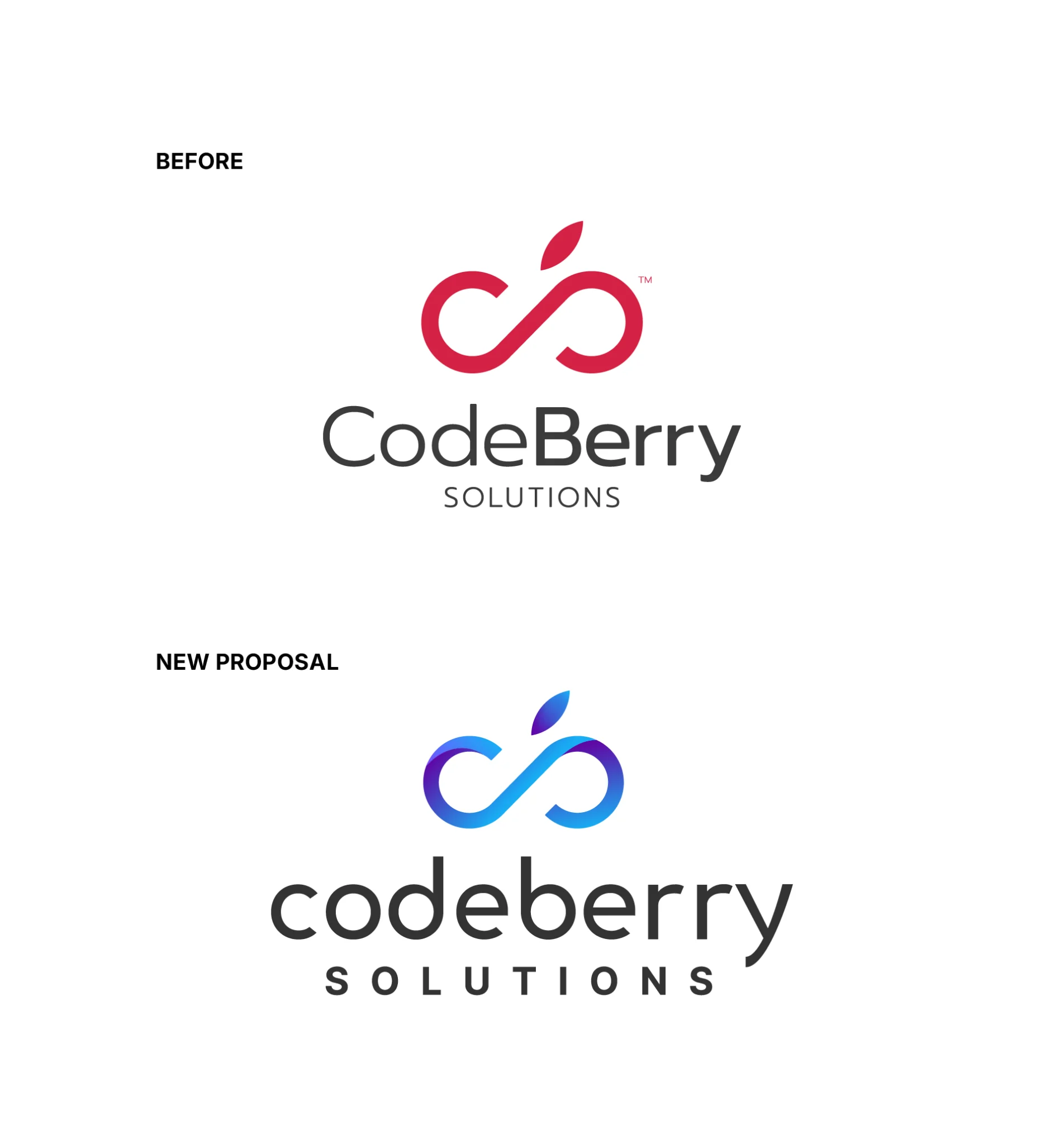
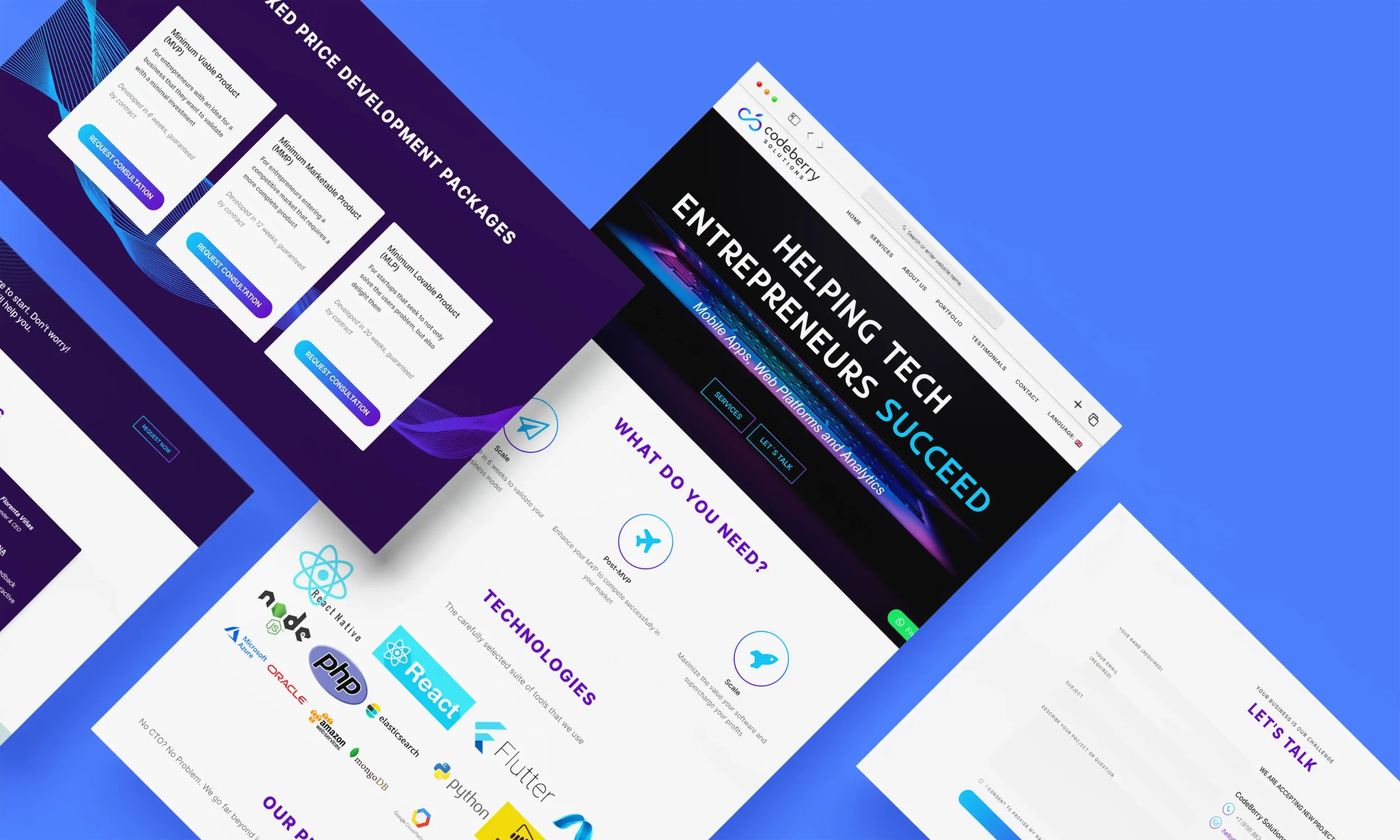
The original branding failed to resonate with clients. The design felt generic and didn’t reflect the technological edge or the approachable, creative nature of the brand. The color palette was also off-brand—neither modern nor representative of the “berry” concept the name implied.
Goals
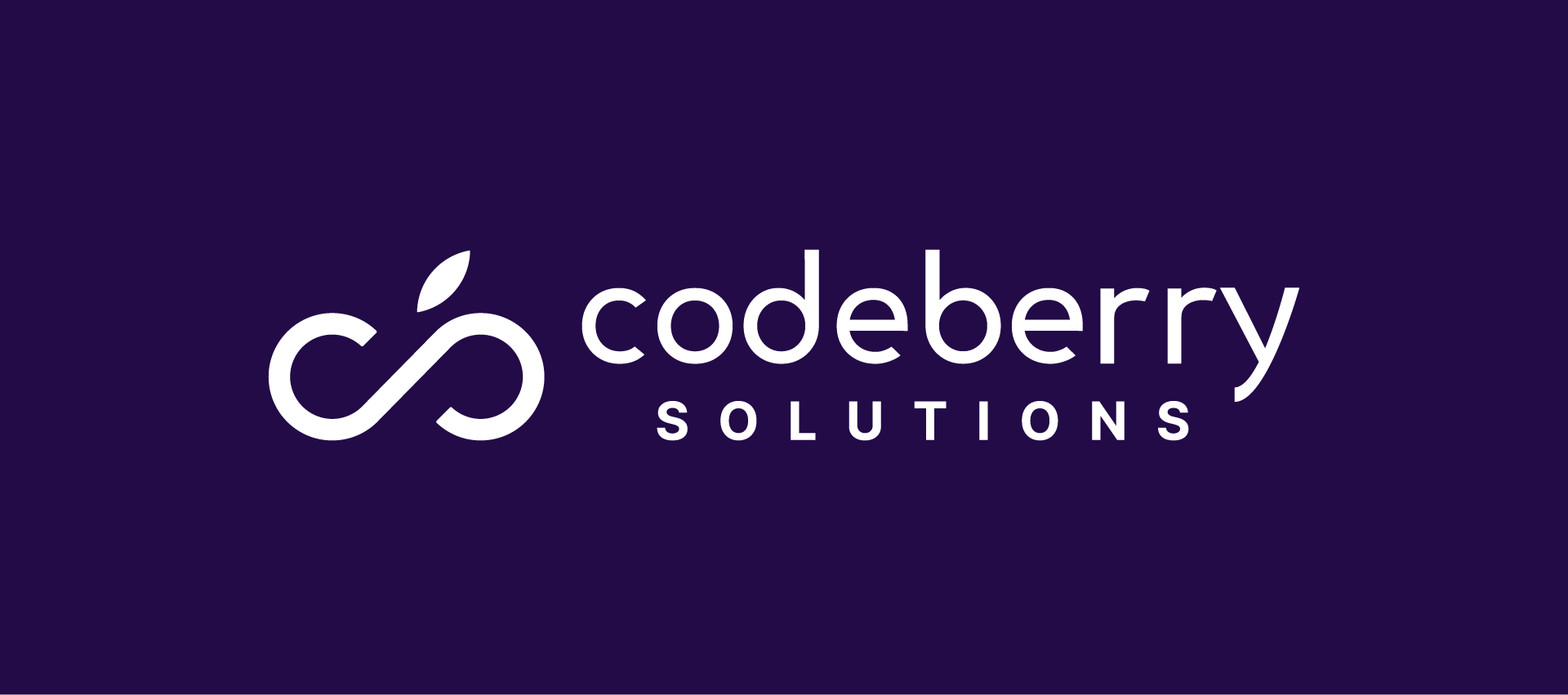
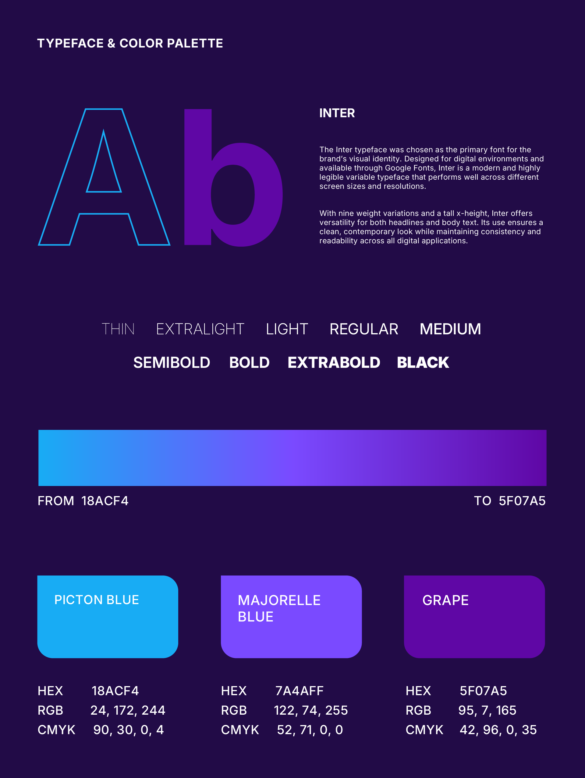
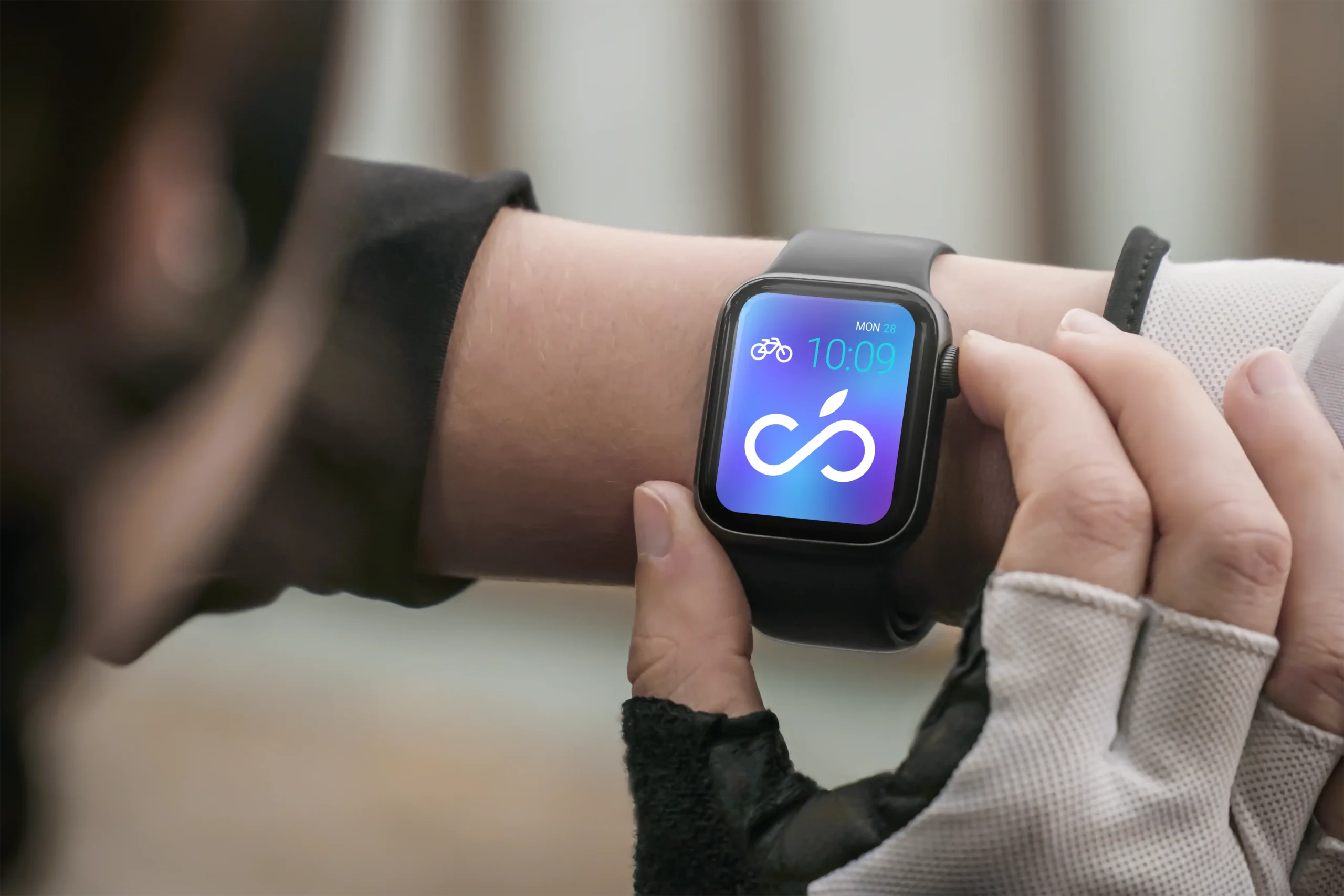
The goal of the project was to redesign the brand to feel more tech-forward while maintaining a warm and approachable vibe. Visual elements were incorporated to subtly reference "berries," aligning with the name "CodeBerry." Additionally, a new color palette in shades of blue and purple was defined to communicate innovation, trust, and creativity.
Solution
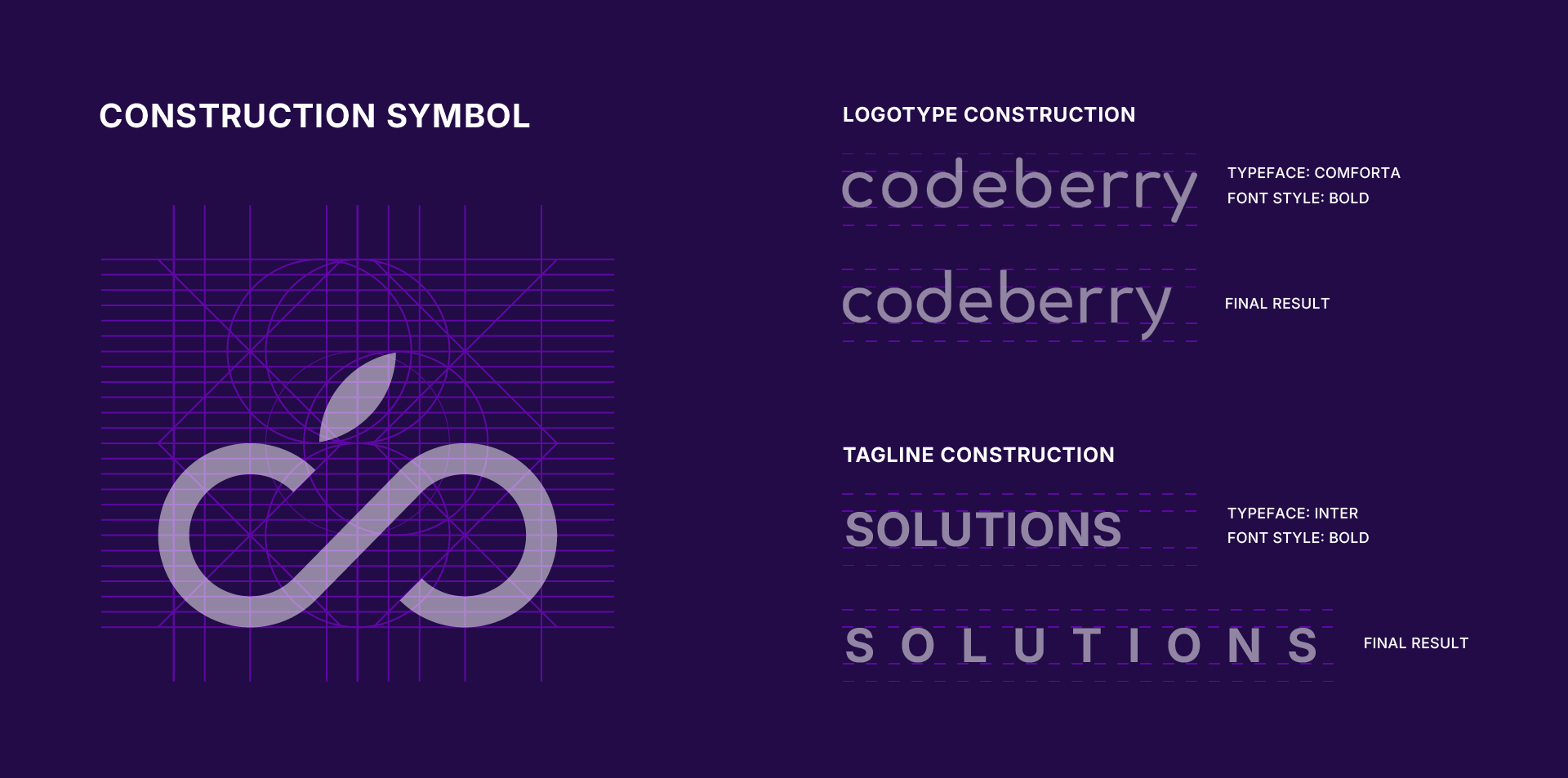
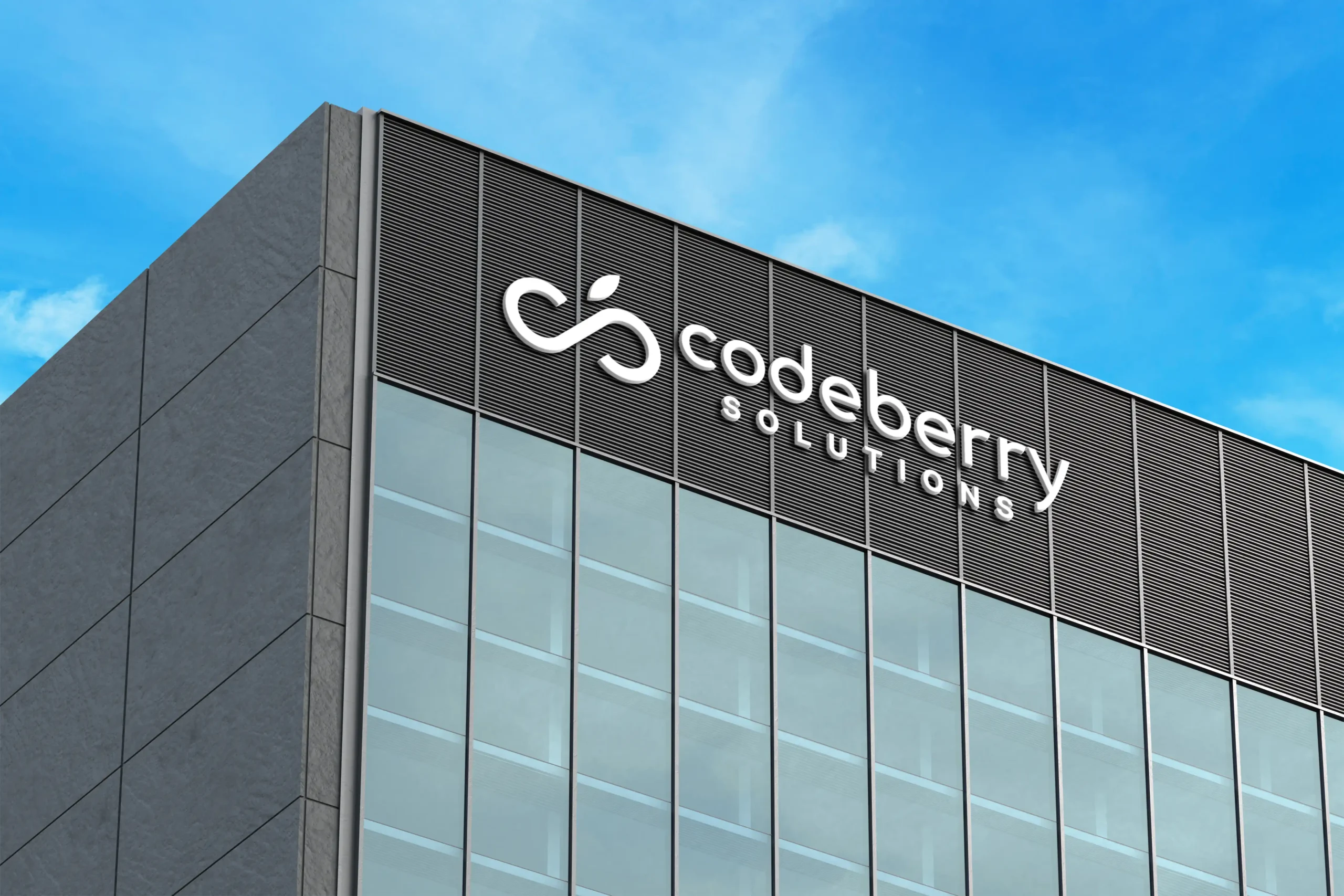
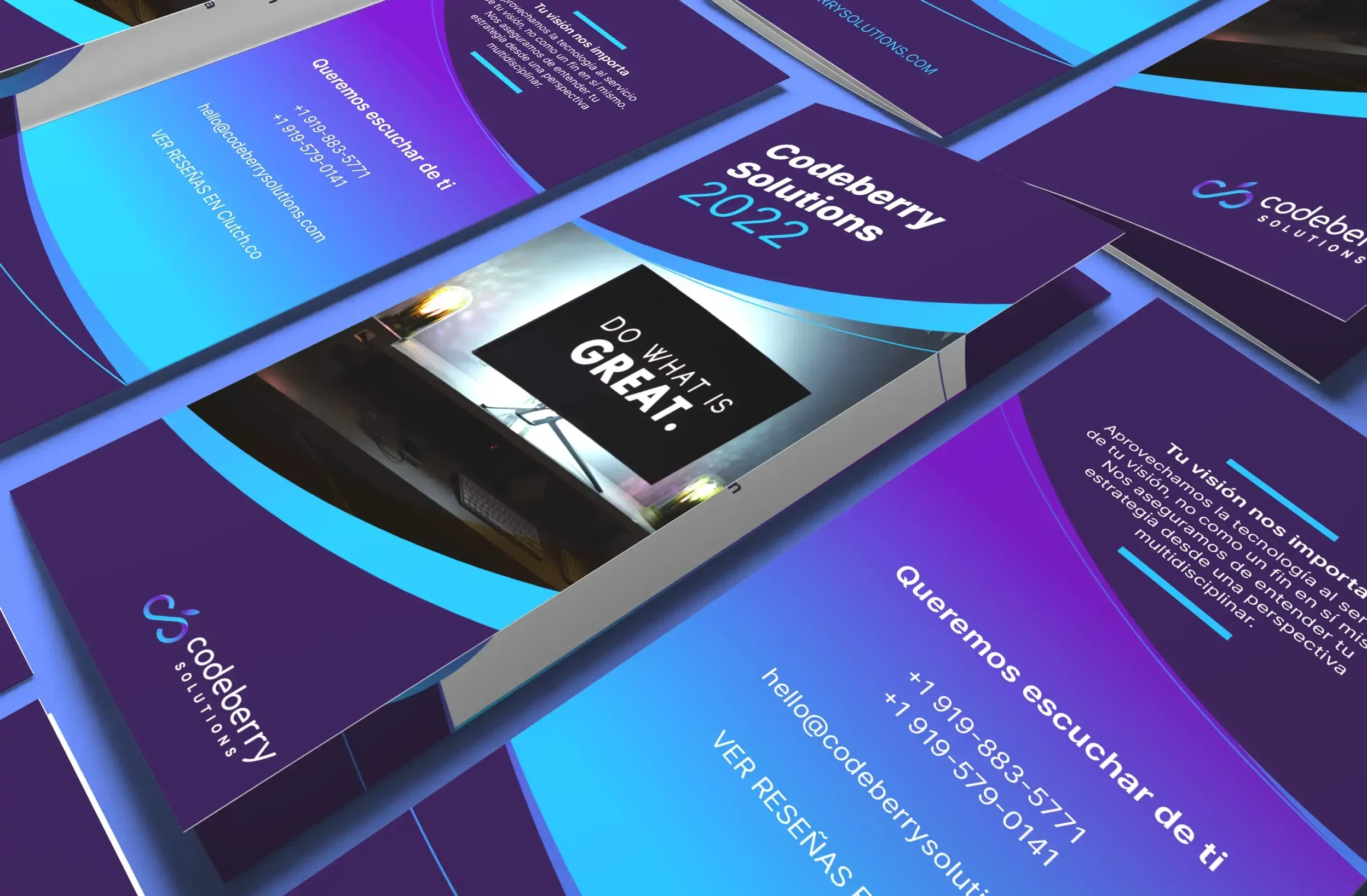
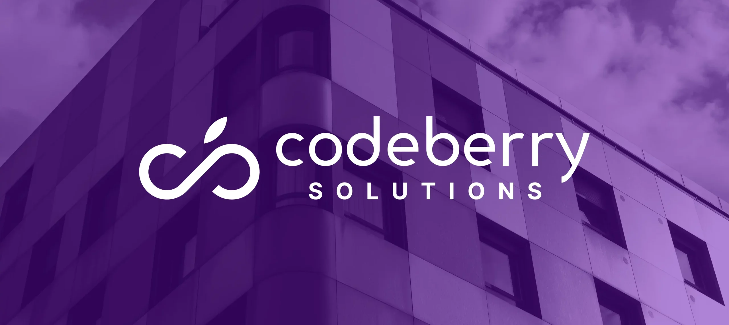
I developed a refreshed brand identity rooted in a modern and technological aesthetic, while subtly evoking the softness and friendliness of berries. The new logomark incorporates abstract, geometric shapes that suggest both data flow and berry clusters. A refined blue-purple gradient was chosen to reflect the brand’s tech focus and creative energy. The typography was updated to a clean, contemporary sans-serif that enhances legibility and reinforces the modern look.
Results
The result was a visually cohesive and memorable brand identity that clients now easily connect with. The redesign received positive feedback from both internal team members and new prospects, enhancing the studio’s reputation. Moreover, the brand’s recognition improved, better aligning with the studio's mission and target audience.