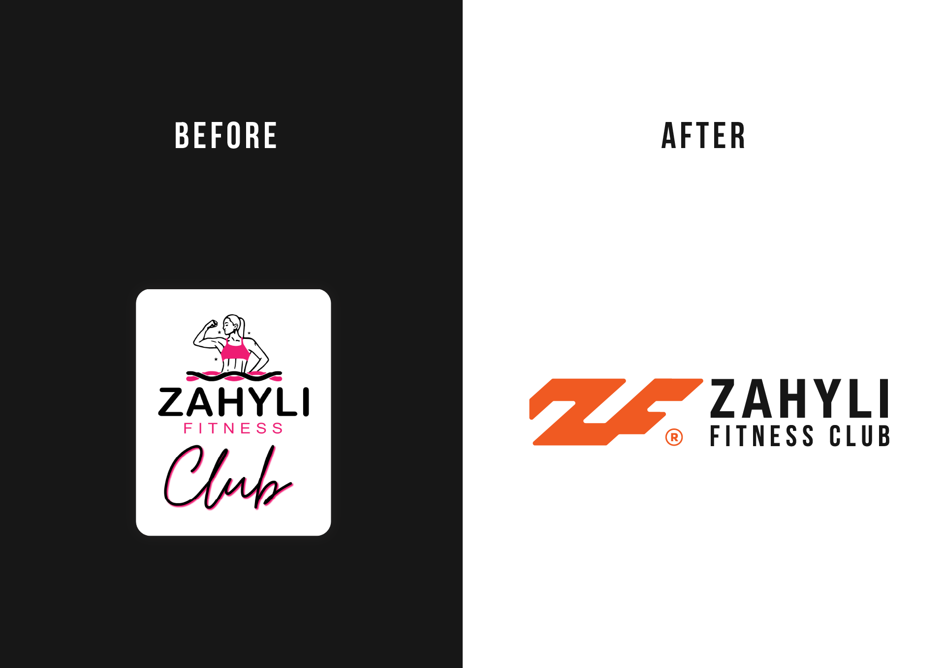
Zahyli Fitness Club is a personal training business led by Zahyli, a fitness coach based in Cape Coral, Florida. With a loyal client base and a motivational approach to wellness, Zahyli decided to completely refresh her brand identity to reflect her professional growth. Her previous branding, centered around a cartoon-like figure, lacked personality, versatility, and failed to convey the strength and professionalism that define her services.
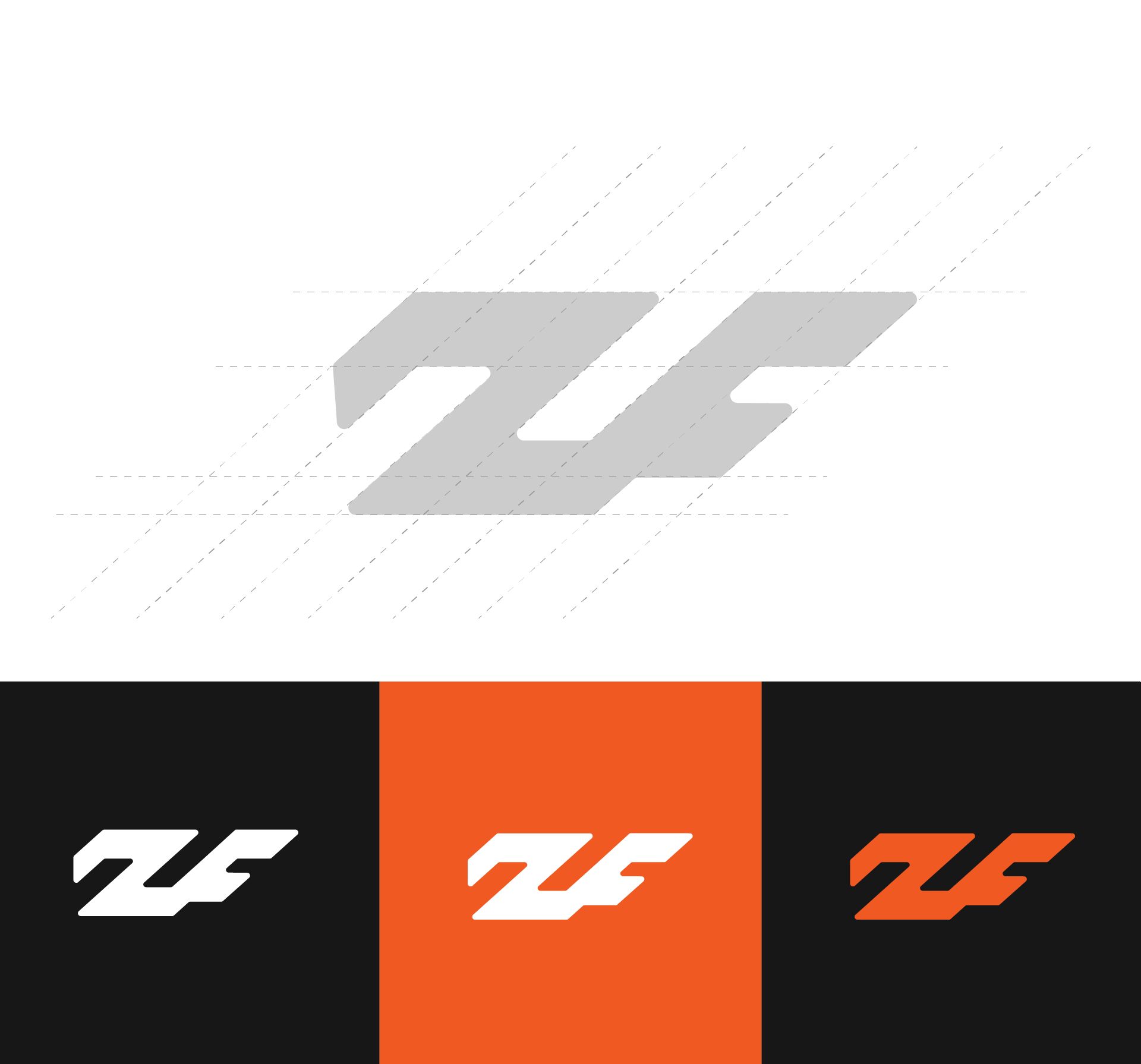
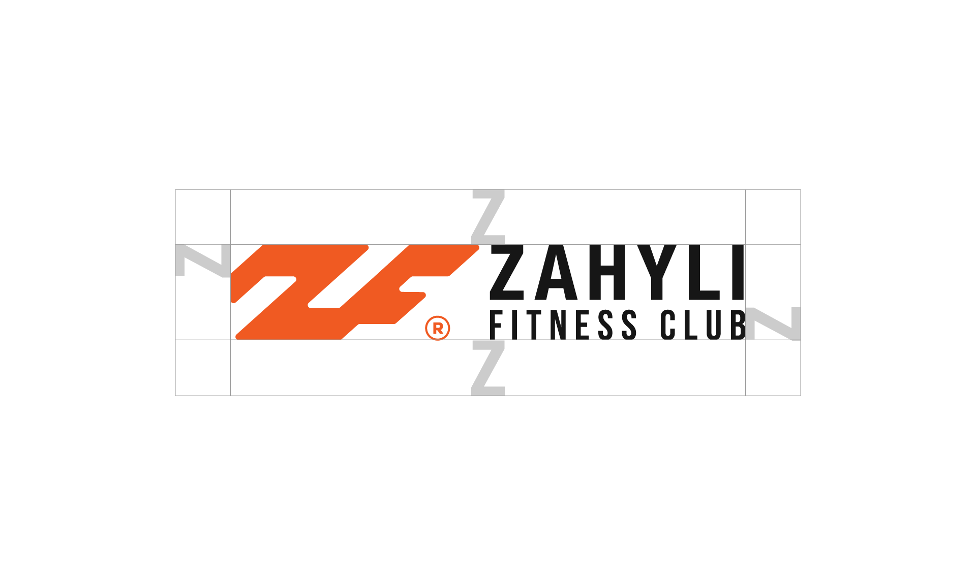
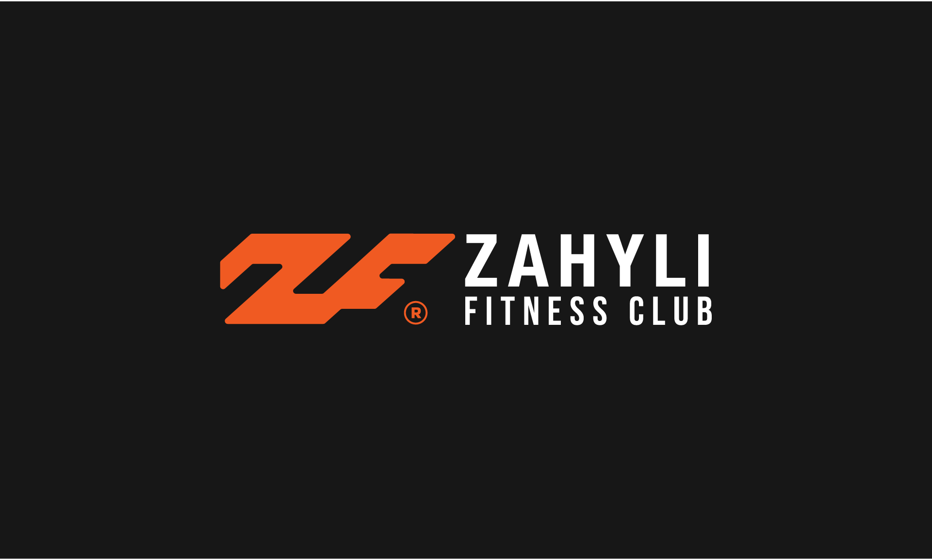
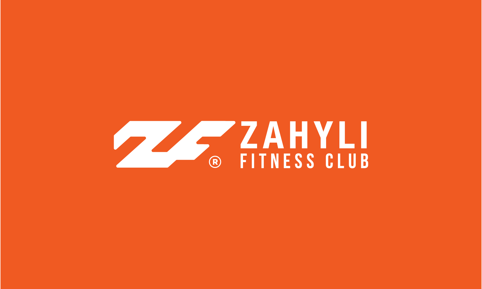
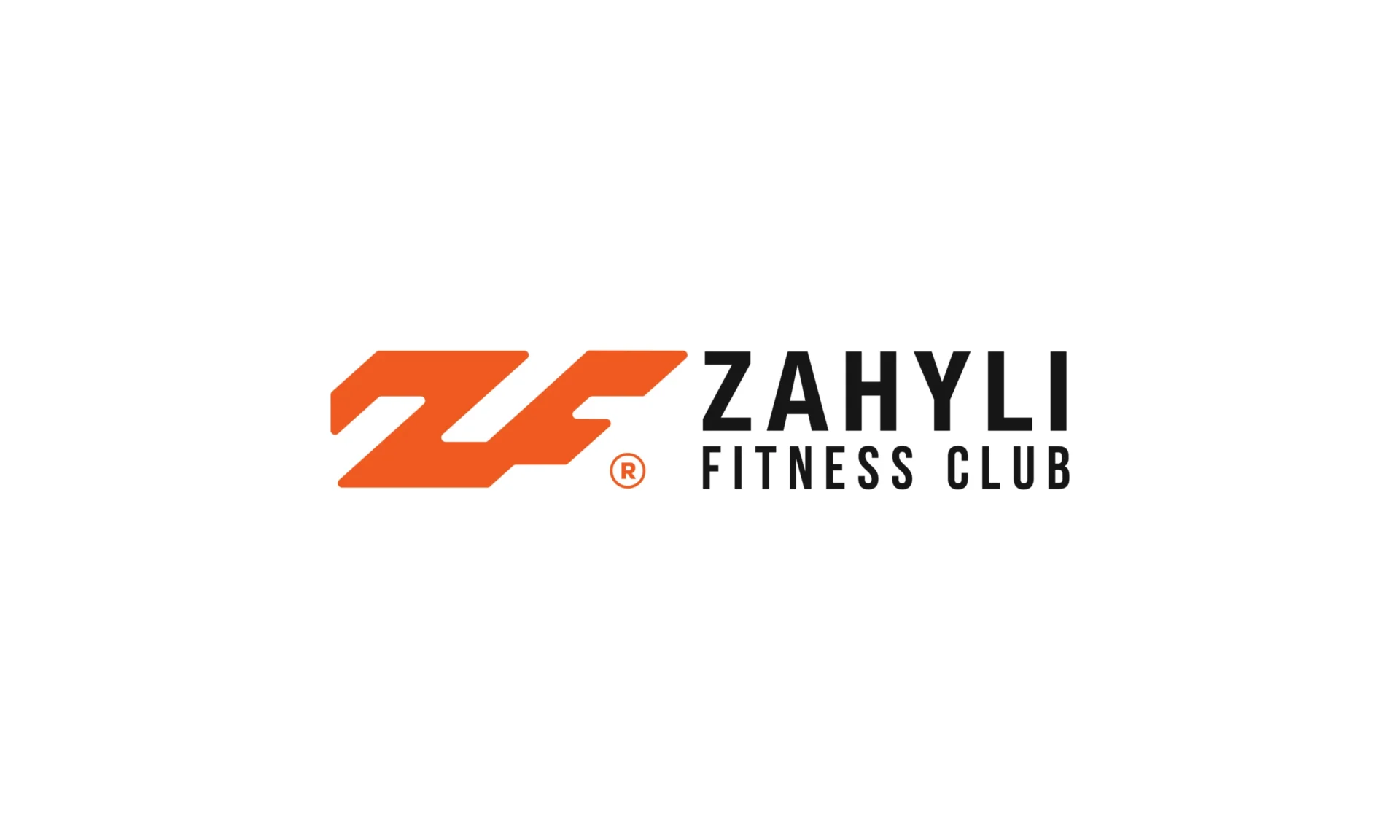
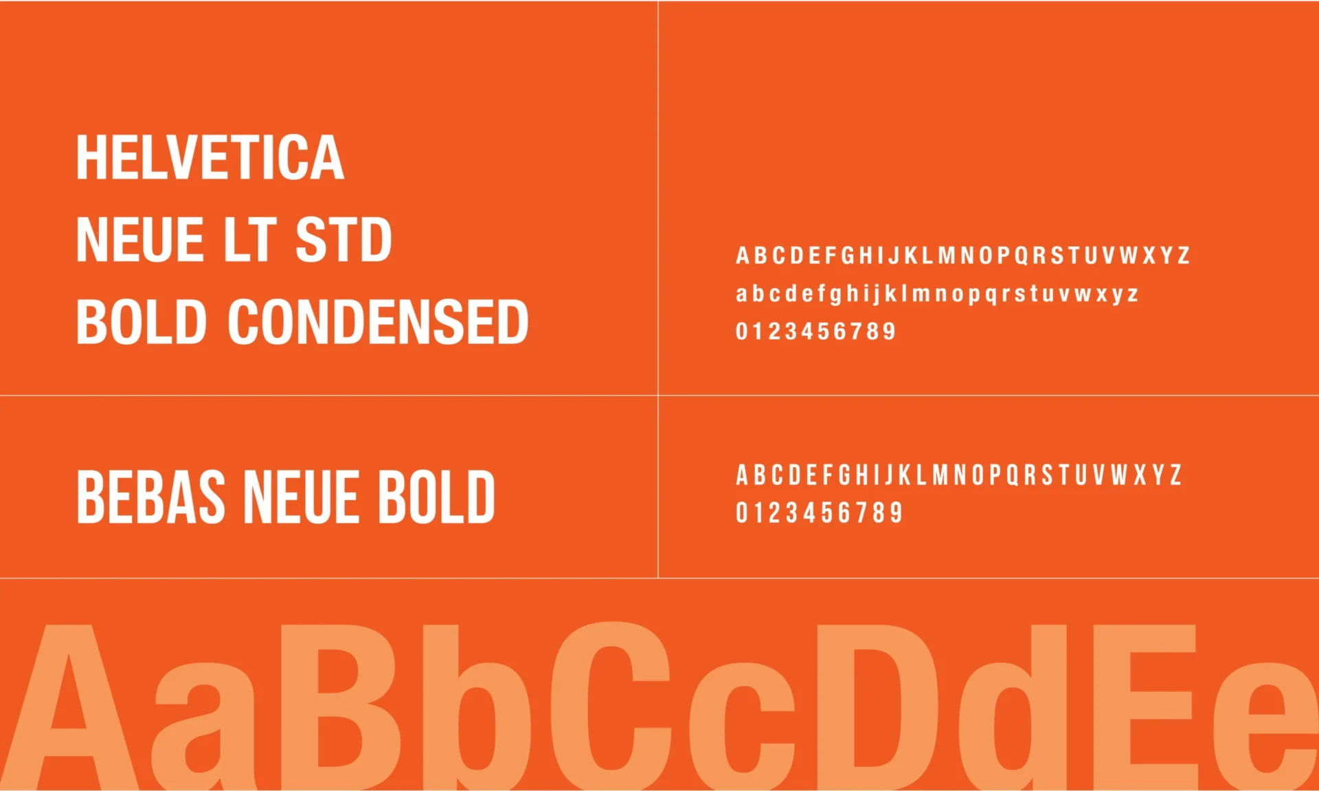
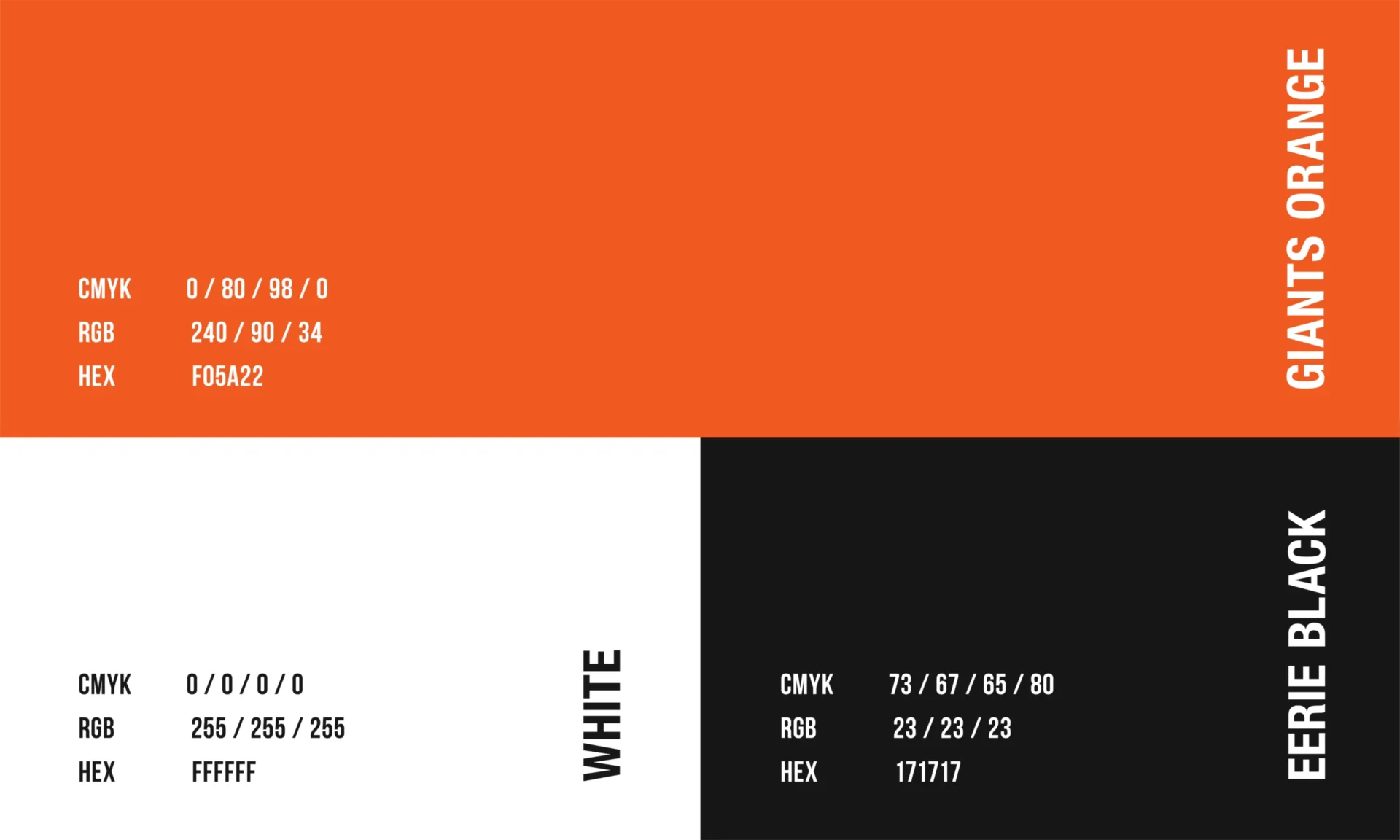
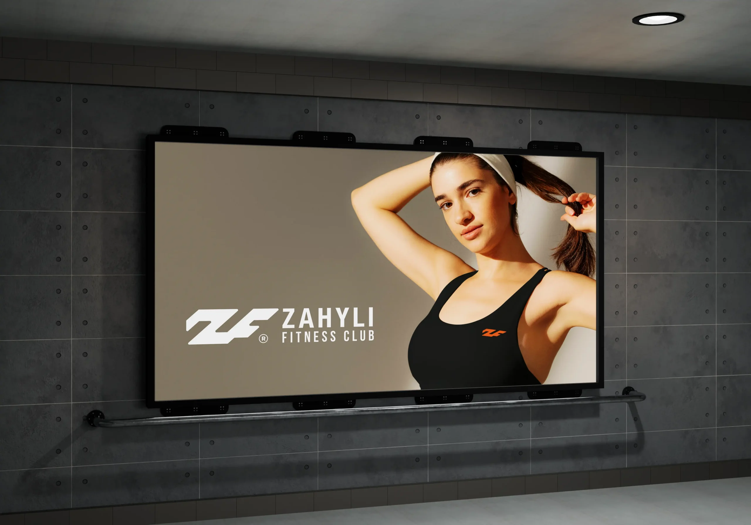
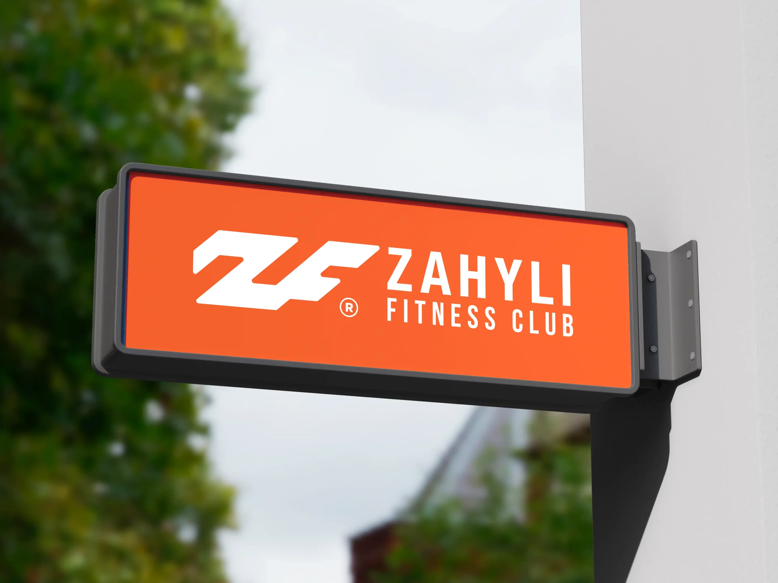
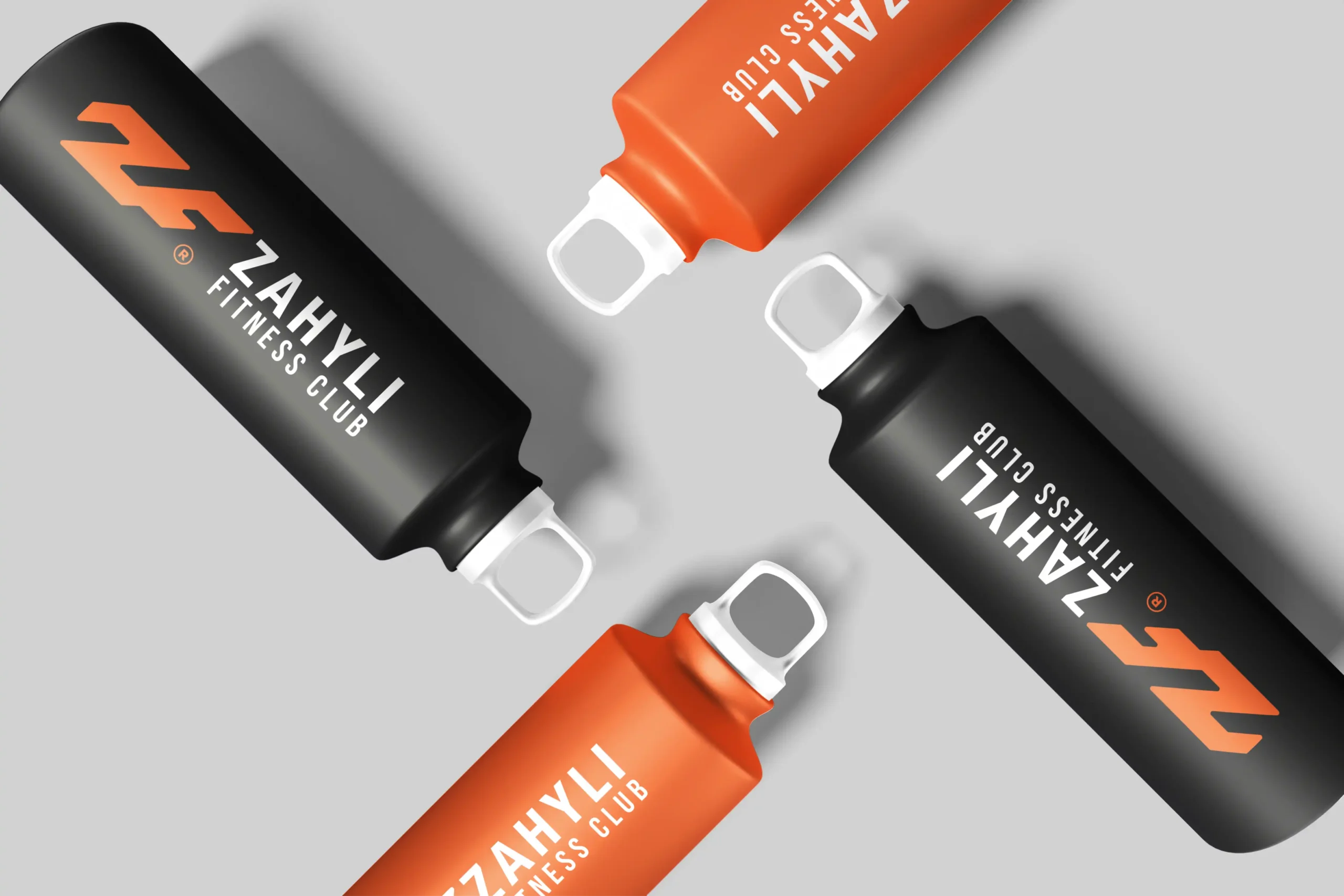
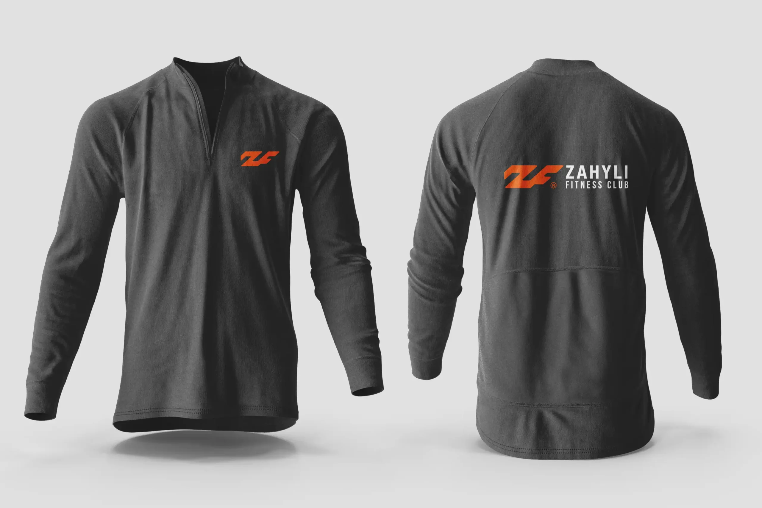
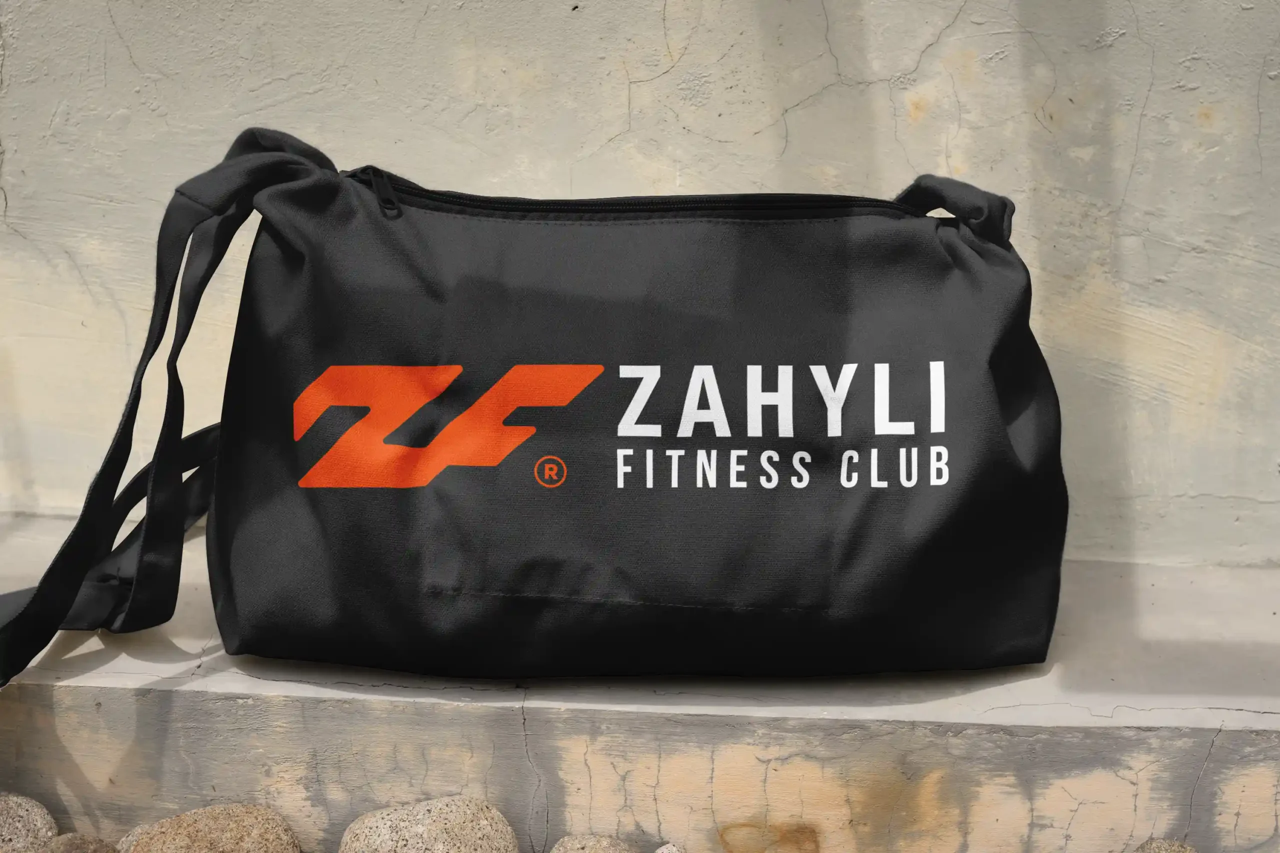
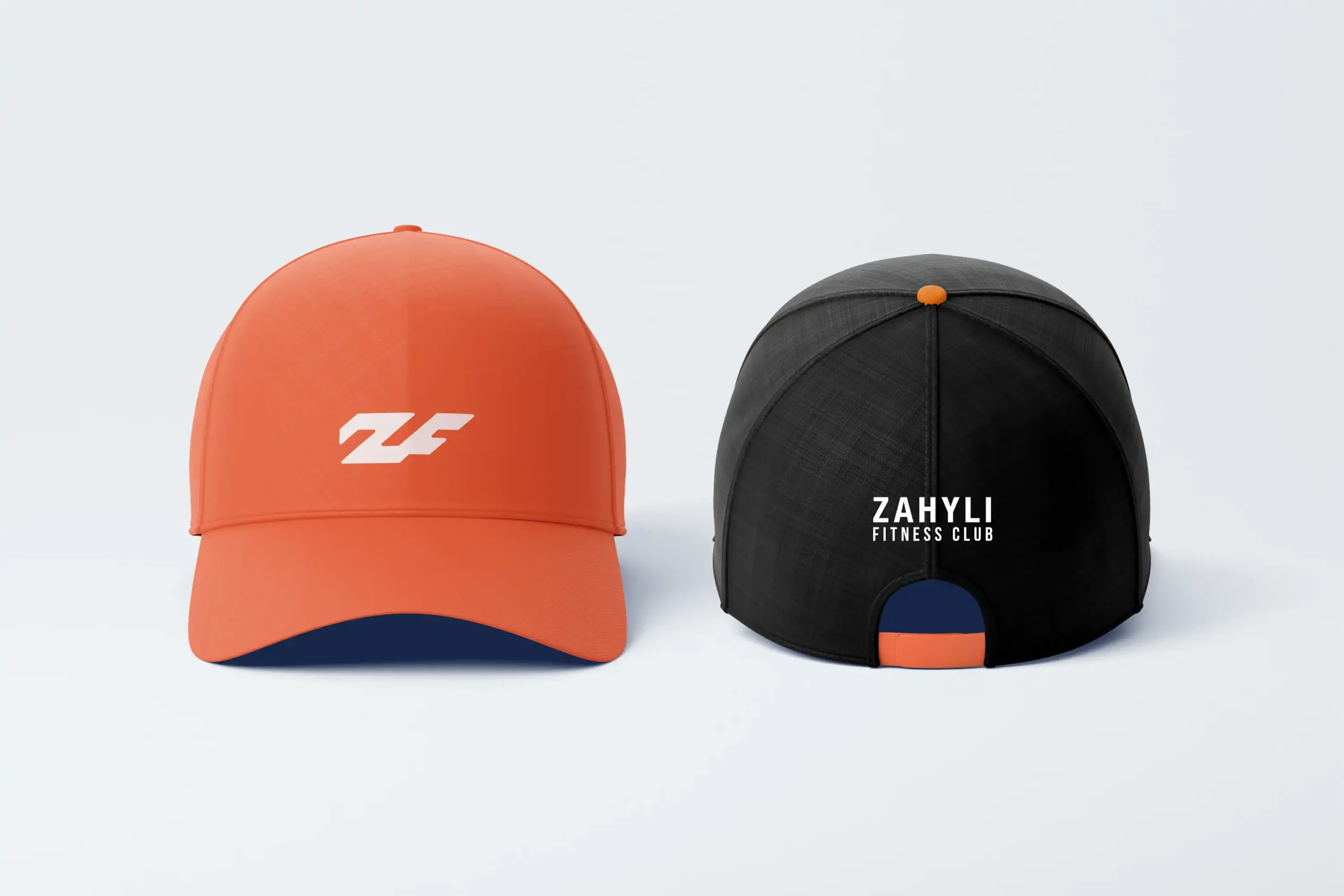
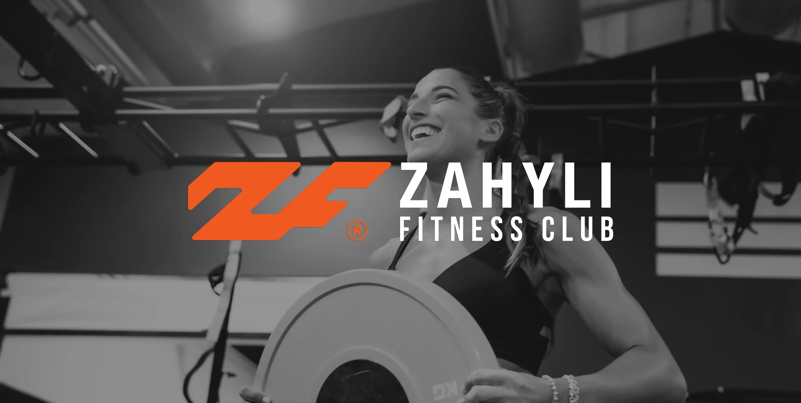
The redesign focused on developing a modern, dynamic logomark that combines the initials “Z” and “F” (for Zahyli Fitness), resulting in a bold and distinctive visual shape. The new brand identity adopts a vibrant color palette of orange, black, and white, expressing energy, determination, and a sporty spirit. This updated look not only enhances brand perception across digital platforms and promotional materials, but also paves the way for a potential expansion into her own line of athletic apparel.
- Zahyli Fitness Club
- Cape Coral, Fl
- Brand Identity Redesign
- Fitness / Personal Training
Challenge
Zahyli’s existing brand identity lacked originality and failed to resonate with her evolving business goals. The cartoon-like logo was difficult to reproduce at different sizes, didn’t communicate her strengths as a personal trainer, and wasn’t scalable across mediums such as apparel, digital, or promotional materials.
Goals
To redesign Zahyli Fitness Club’s brand identity in a way that reflects her energetic, professional, and bold personality, while also creating a versatile logo system that could be used on merchandise, digital platforms, and potentially evolve into a sportswear line.
Solution
The redesign focused on crafting an imagotype that combined the initials “Z” and “F” into a clean, athletic-inspired symbol. The new design eliminated the cartoon figure and introduced a more dynamic and confident visual identity. The bold orange color was chosen to evoke energy, strength, and motivation—core elements of Zahyli’s coaching style—while black and white provided contrast and flexibility.
This new identity was created with scalability and usability in mind—from embroidered caps and pullovers to social media and printed materials. The symbol also leaves the door open for Zahyli to expand her brand into a fitness apparel line.
Results
The redesign resulted in a strong, modern brand identity that aligns seamlessly with Zahyli’s business vision and energetic personality. The new logo is fully scalable and versatile, making it suitable for a wide range of applications—from athletic apparel to digital platforms. This cohesive visual system not only enhanced brand recognition but also elevated the overall professionalism of her presentation. As a result, Zahyli received positive feedback from her clients and gained greater confidence in promoting her services and exploring future brand expansion opportunities.